Identity System
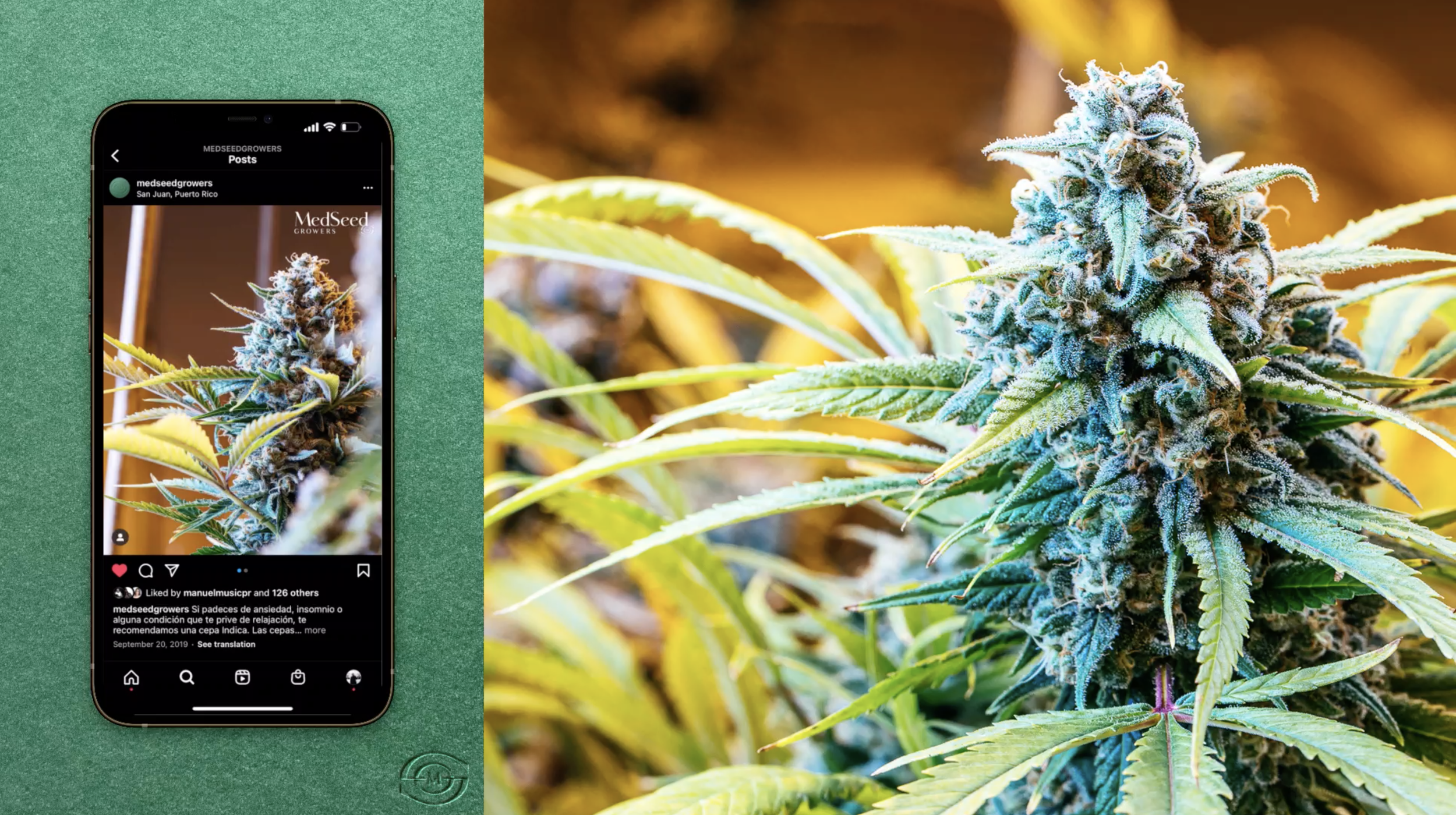
MedSeed Growers is a Puerto Rican company founded in 2019 that cultivates and distributes medicinal cannabis and medicinal cannabis products to local dispensaries. Their main objective is to produce high-quality medicinal cannabis products while following the strict laws and standards in this industry in Puerto Rico.

Solution
The main source of inspiration for developing the brand logo was a seed that represents the growth of a new company, and that of the cannabis plant. It also represents a family tree to the owners since they decided to make this a family business with the father and his children. At the time of creating the brand there weren’t many cannabis producers in Puerto Rico with an elegant and high-end look/feel to them which were very important to convey.


Packaging was a very important component when developing the brand. We took inspiration from the element of water to represent the different categories of cannabis: Indica, Hybrid, and Sativa. Inspired by the ripples created by water we created an identity for each category. We utilized a darker blue and straight ripples to represent Indica which is usually more calming and recommended to use at night for ultimate relaxation. Dark green and more curved ripples to represent the Hybrid Category and tan orange with more expanded and movement to the ripples to represent Sativa.
MedSeed Growers is now one of the main distributors of medicinal cannabis products in Puerto Rico and continues to shape and lead the way in the industry with innovative products.


Goals/Strategy
Our goal was to create an identity that was elegant and high-end that represented the company and its products. Using elements from nature like the seed and water as inspiration helped us convey what MedSeed is and represents.
Flight Crew (Creative Team):
Humberto Torres, Yeiniz Nevarez
Created:
2019